Every 2026 Color of the Year We Know So Far and How to Style Them
This site contains affiliate links to products. We may receive commission for purchases made through these links. Price at time of publish date may change.
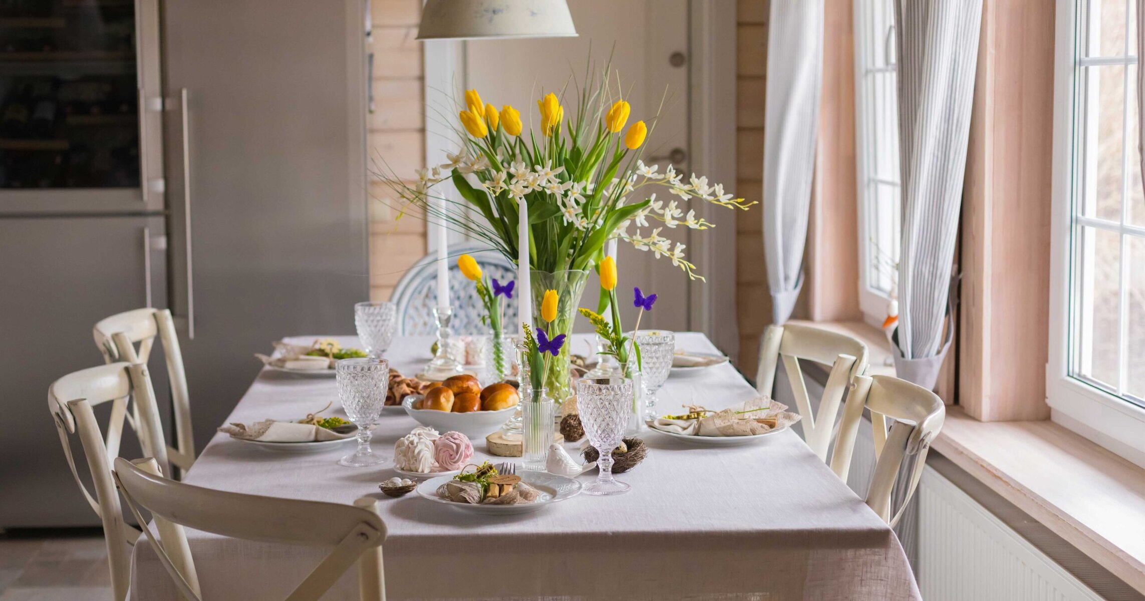
The first few months of the year have brought us a world of new colors, styles, and trends already—from creative houses and paint manufacturers releasing their 2026 Color of the Year to fashion houses and designers forecasting the trends we’ll see in our homes and wardrobes in the months ahead. So far, we’ve discovered a variety of predictions that range all across the board. While some brands are venturing into bold or inspiring color choices to stamp the next 365 days, others have decided on more subdued, neutral colors to mark their trend predictions for the upcoming year.
What stays true throughout all the Color of the Year predictions this year no matter the hue, however, is this feeling of confidence. Be it through wellness, authenticity, inspiration, or another motivator, every brand’s color prediction encourages a similar self-assuredness. In 2026, we’re seeing everything from muddy green, to rich walnut, bold cherry red, and even a cloudy shade of white. But each one is expressing a confident self-awareness.
We spoke to some of the most influential names in the Color of the Year catalog to dive deeper into the reason for each chosen hue, as well as ideas for how to style them, and the nuances behind their color predictions. Come explore what’s forecasted in color for the year ahead! Make sure to keep tabs on our Drew & Jonathan Color of the Month, too, where we talk with our in-house trend expert to analyze the colors in vogue with every calendar flip.
Spearmint by KitchenAid
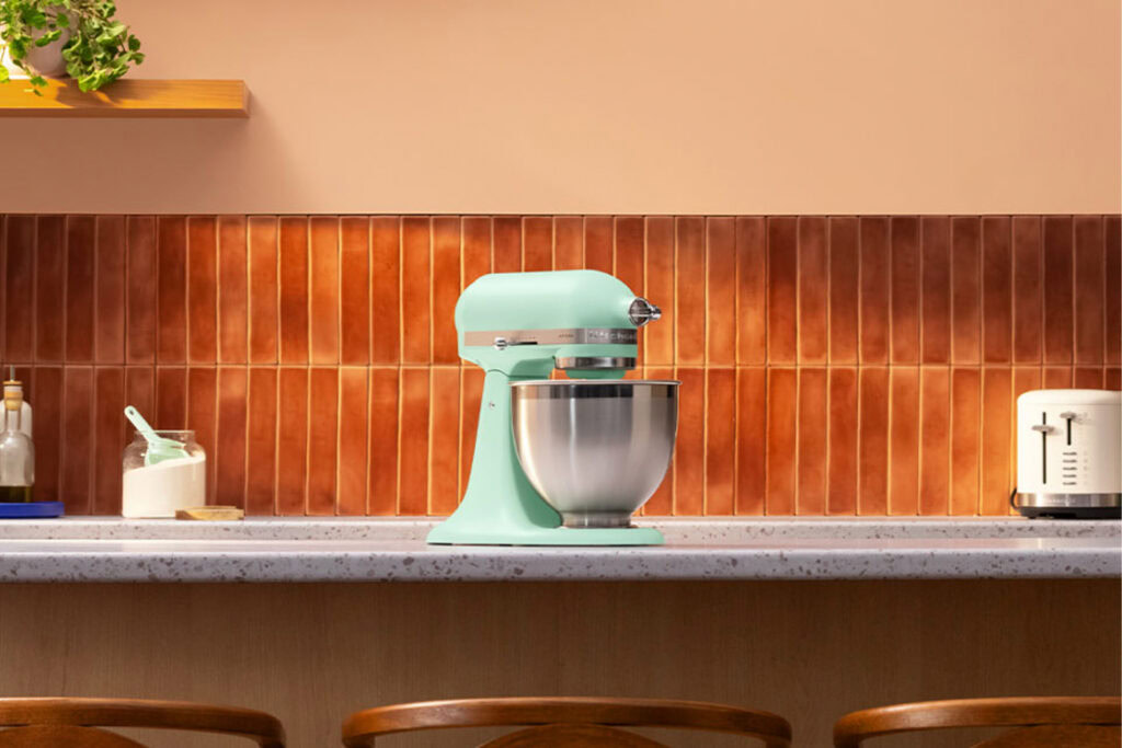
KitchenAid’s 2026 Color of the Year is Spearmint, a bright and juicy hue that aims to add contrast and energy to your cooking space. This minty tone feels fresh and exciting, and makes for an especially bold look for the year ahead. “For this year’s color, we were driven by a desire to refresh our senses and find a moment of clarity,” says Brittni Pertijs, Lead Color, Material & Finish Designer at KitchenAid. “This color breathes life into a space, filling it with a soothing yet invigorating energy.”


Rebel Pink by IKEA
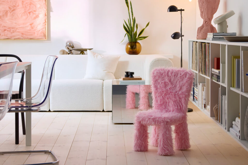
IKEA is celebrating pops of unexpected color for 2026. Their Color of the Year, Rebel Pink, is bold, fun, and playful—a hue we’re excited to embrace. According to IKEA’s 2026 style guide, “We took a deep dive into macro trends in design, fashion, and culture, specifically how these things come to life in our homes. It’s not about what’s trending, it’s about how color can transform a space, evoke emotion, and reflect the way we live. [Rebel Pink] is a bold neutral and our way to energize your everyday aesthetic without compromising our commitment to Scandinavian simplicity.”
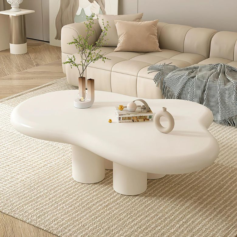
Cloud Dancer by Pantone
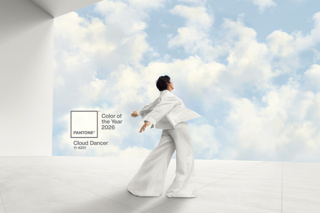
Pantone aims for its Cloud Dancer hue to evoke a sense of peace, renewal, and spatiousness. According to Pantone’s website, Cloud Dancer was chosen as a representation of quiet reflection and calm focus: “With its expansive presence, PANTONE 11-4201 Cloud Dancer invites a space where function and feeling intertwine to build atmospheres of serenity and spaciousness, providing a refuge of visual cleanliness that inspires well-being and lightness.”
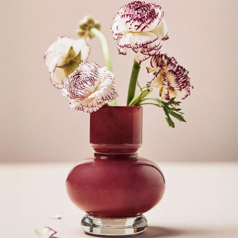
Patina Blue by Etsy
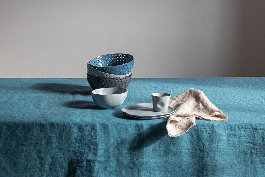
Not only did Etsy announce their gorgeous Patina Blue as their 2026 color of the year—for the first time, they also released a texture of the year: Washed Linen. Together, the two make up the trends predicted to explode this coming year. In Etsy’s announcement, “Patina blue is one of those shades that just instantly makes you exhale. Inspired by copper’s natural aging process, it embodies the quiet magic of change and the way materials evolve as they’re lived-in and loved. The hue reflects a growing appreciation for pieces that wear in, not out—which helps explain why searches for “blue copper” have surged more than 3x. Patina blue brings a calm confidence to any space, whether your style leans more modern, vintage-inspired, or somewhere in between.”


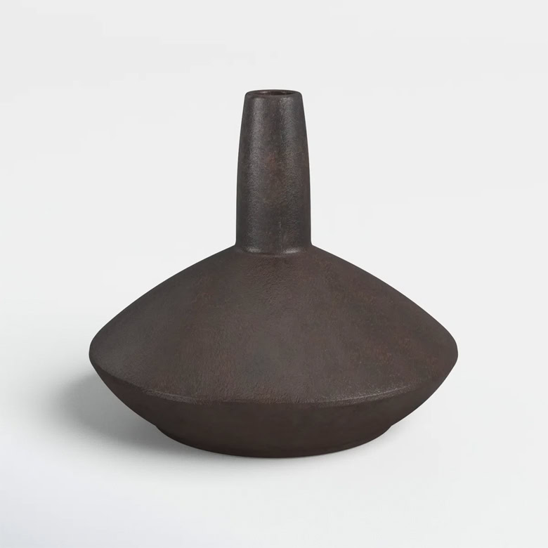
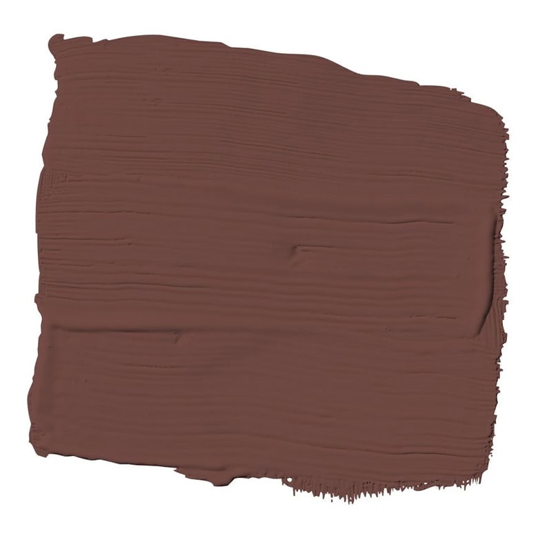
Silhouette by Benjamin Moore
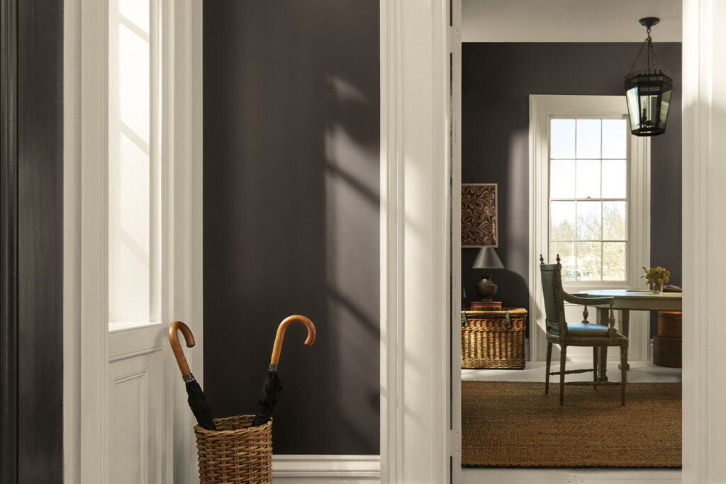
For their 2026 Color of the Year, Benjamin Moore has decided on Silhouette AF-655. “The connection between fashion and interiors has always been a source of inspiration but this year in particular, we’ve noticed a renewed interest in suiting and classic silhouettes; the resurgence of timeless pieces; and the growing interest in the brown color family,” said Andrea Magno, director, color marketing & design at Benjamin Moore. “Silhouette embodies these qualities with its depth and luxurious blend of burnt umber and delicate charcoal undertones. Like a perfectly tailored suit, this hue has the versatility and softness to bring a space from expected to exceptional.”
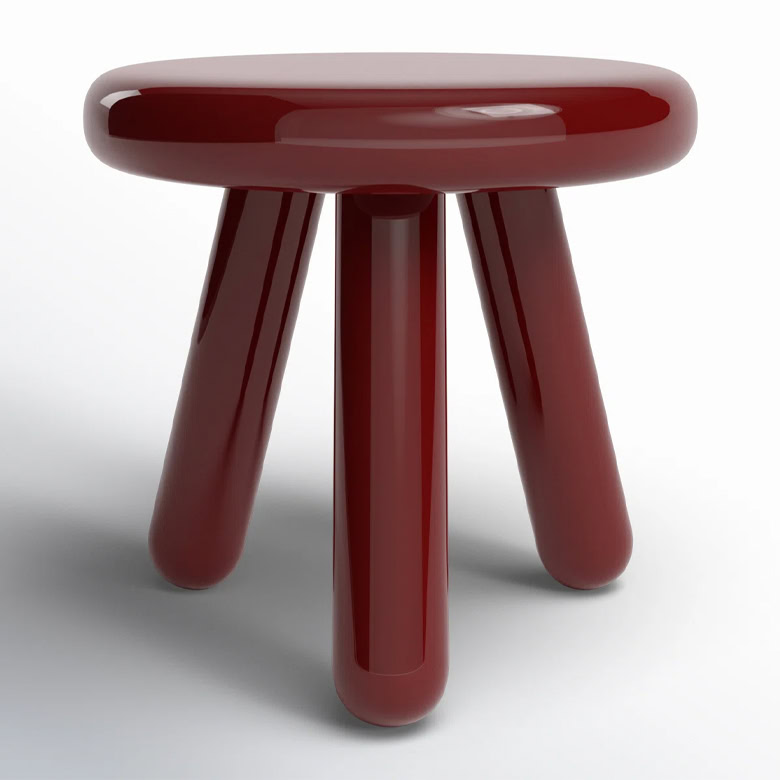
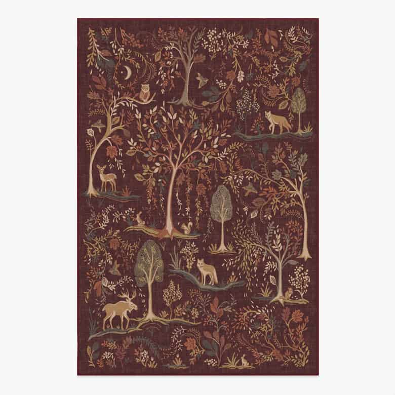
Divine Damson by Graham & Brown
Divine Damson is a nutty, chocolate-plum color that can transform a room into a show-stopping design. According to the Graham & Brown site: “A perfect deep damson shade, the Color of the Year 2026 is a timeless and versatile color that suits a variety of styles and environments. The dark damson color evokes a sense of elegance, luxury and sophistication.” Alongside their Color of the Year, explore their Design of the Year (Eternal Weave, a whimsical print that mixes natural and mystical designs) and Mural of the Year (Eternal City, inspired by the Pink City of Jaipur) on their site, too.
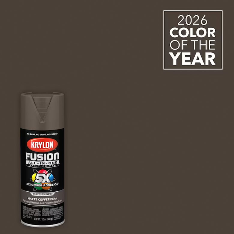
Coffee Bean by Krylon
Grounded and muddy, Coffee Bean is the perfect addition to the home that aims to create a warm atmosphere. “With its rich, earthy depth, Krylon 2026 Color of the Year, Coffee Bean, lays a harmonious foundation for projects that echo the beauty of nature,” said Lisbeth Parada, Color Marketing Manager at Krylon. Use the spray paint for a DIY project, or incorporate the versatile color in small touches throughout the home and yard.
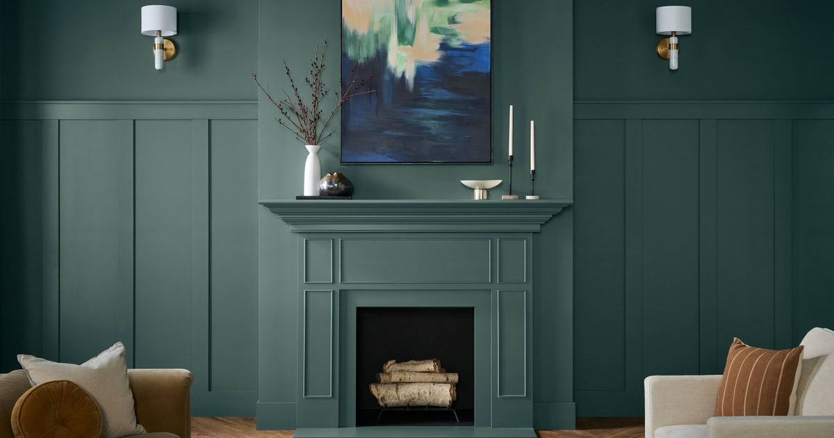
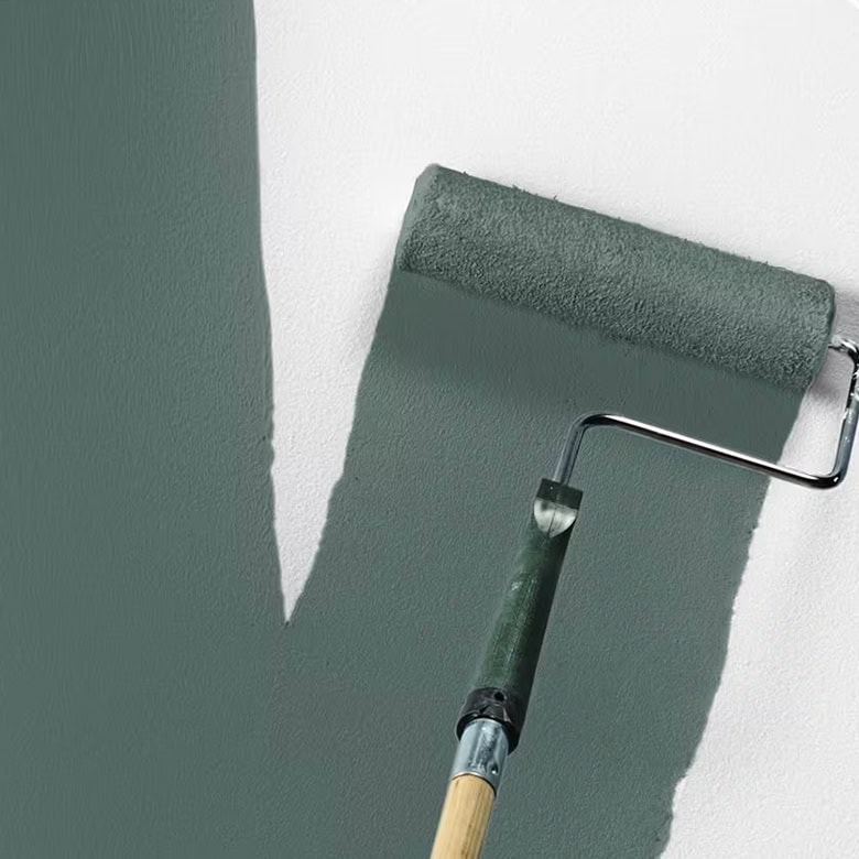
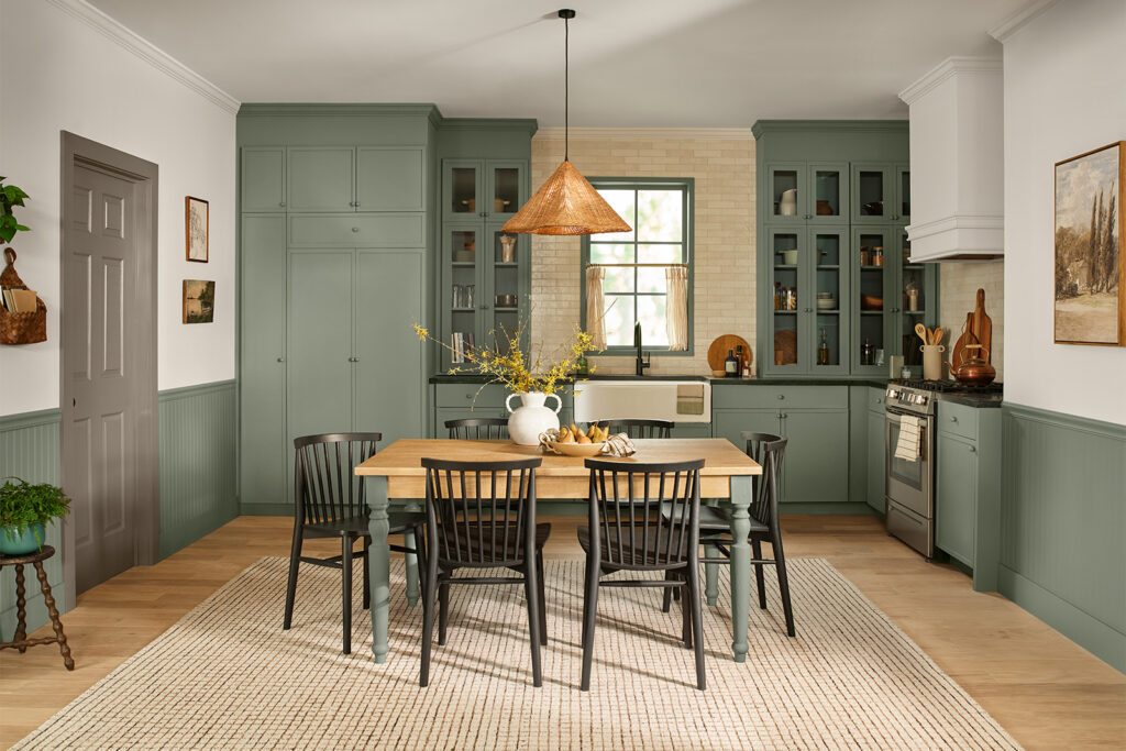
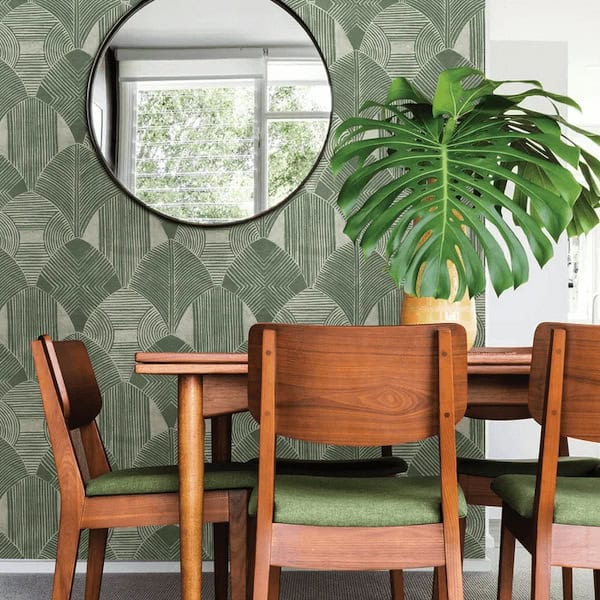
Midnight Garden by Dunn-Edwards
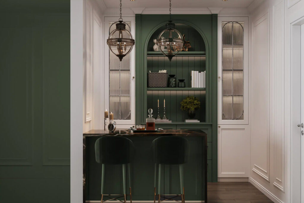
Dunn-Edwards has chosen a muted green hue as their marker for 2026: Midnight Garden. It’s a serene neutral that can blend easily into many spaces and styles. “Midnight Garden is the green that works everywhere—from cabinetry and walls to accents and exteriors,” said Lauren Hoferkamp, Color Marketing Manager at Dunn-Edwards. “Its versatility makes it equally at home on interiors and exteriors, pairing effortlessly with natural textures, warm neutrals, or sleek minimalism.”
Best Seller
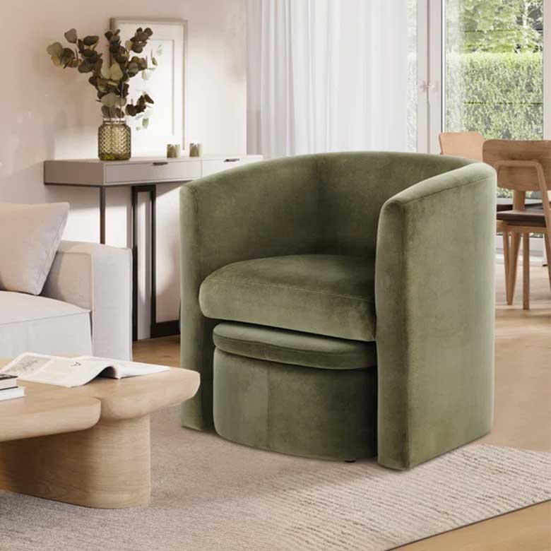
Braedin Upholstered Barrel Accent Chair With Storable Ottoman

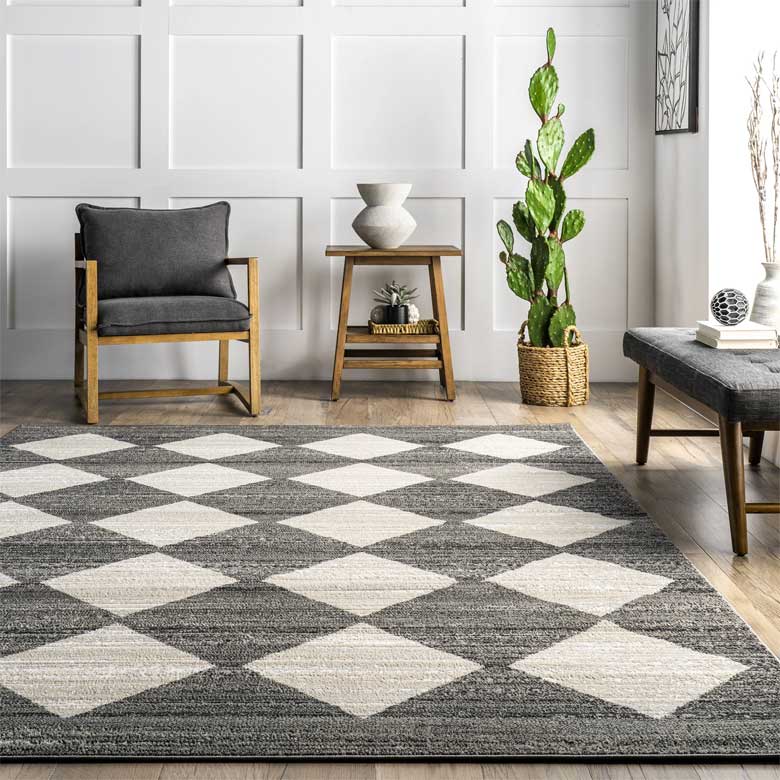
Universal Khaki by Sherwin-Williams
Universal Khaki is refined, approachable luxury inside one dynamic hue. It’s sophistication without pretentiousness; warmth without staleness; and versatility without boredom. “Khaki is more than just a neutral—it’s a timeless, go-anywhere shade that brings a sense of grounded elegance to any space,” shares Sue Wadden, Director of Color Marketing at Sherwin-Williams. “With its warm, earthy undertones, Universal Khaki SW 6150 effortlessly complements a wide range of colors, creating a rich, inviting backdrop that can transform an entire design with quiet confidence.”
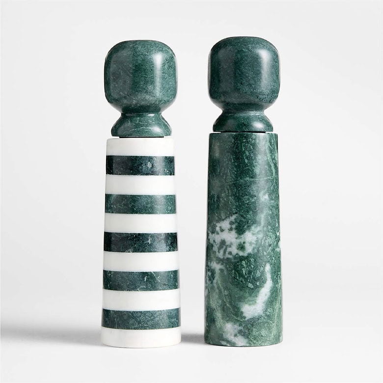
Hidden Gem by Behr
Bold yet familiar, Hidden Gem is a special mix of jewel and earth tones. What’s created is a calming, elegant green that can instantly transform any room into a den of inspiration. “Now more than ever, there’s a growing appetite for colors that challenge convention and bring an unexpected sense of wonder to everyday spaces,” says Erika Woelfel, VP of Color and Creative Services at Behr Paint. “Hidden Gem captures that spirit in both name and color—its depth and refinement meets the desire for colors that are eternally stunning and stylish.”
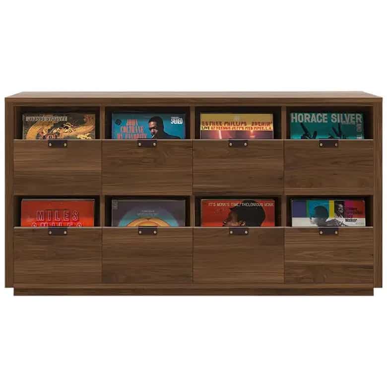
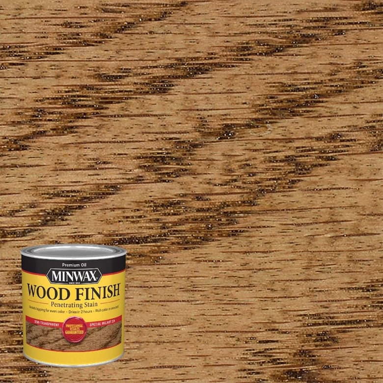
Special Walnut by Minwax
If you’re looking for a stain to pair well with just about any of your decor no matter your style or taste, you can’t go wrong with Special Walnut. “With wood emerging as a key element in interior design—from furniture and flooring to cabinetry and architectural details—there’s a renewed appreciation for finishes that enhance its natural character,” says Lisbeth Parada, Color and Design Lead at Minwax. “Special Walnut delivers with a classic, dimensional tone that feels both familiar and fresh. Its versatility makes it a favorite across styles and applications—whether you’re restoring a vintage piece or finishing a weekend project.”
Melodious Ivory by Dutch Boy Paints
“Our 2026 Color of the Year invites homeowners to embrace what matters most—comfort, quality and connection,” says Lisbeth Parada, Color Marketing Manager at Dutch Boy Paints. “Melodious Ivory offers a classic backdrop that beautifully supports the textures, elements and personal touches that make a space truly feel like home.” And what’s great about it, too, is how well it complements other colors and patterns. Its warmth will provide that cozy feel no matter what, and its neutrality acts as the perfect companion to any bold design.
Warm Eucalyptus by Valspar
“Warm Eucalyptus is more than just a beautiful shade of green, it’s a reflection of the comfort we crave in our homes,” says Sue Kim, Director of Color Marketing at Valspar. “Its warm undertones create a grounded, welcoming mood while drawing inspiration from nature and the familiarity of retro design. This is a color that encourages restoration and resilience.” This shade could look beautiful just about anywhere when utilized right. Pair with complementary shades of rich brown, amber, or dark walnut for a vintage-inspired look that still feels fresh.
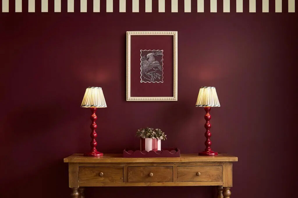
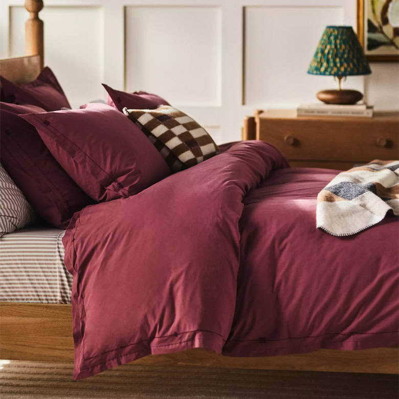
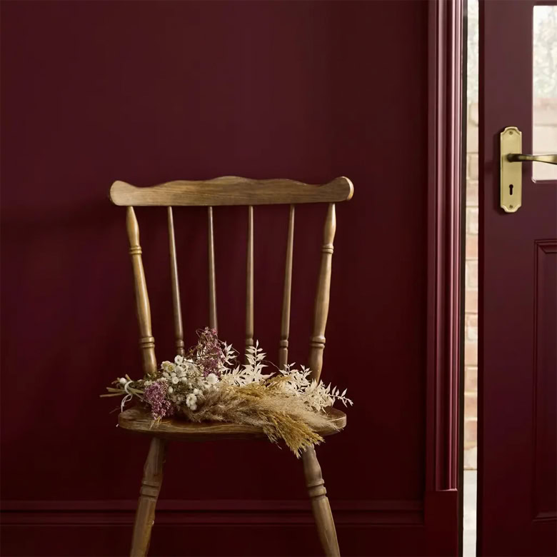
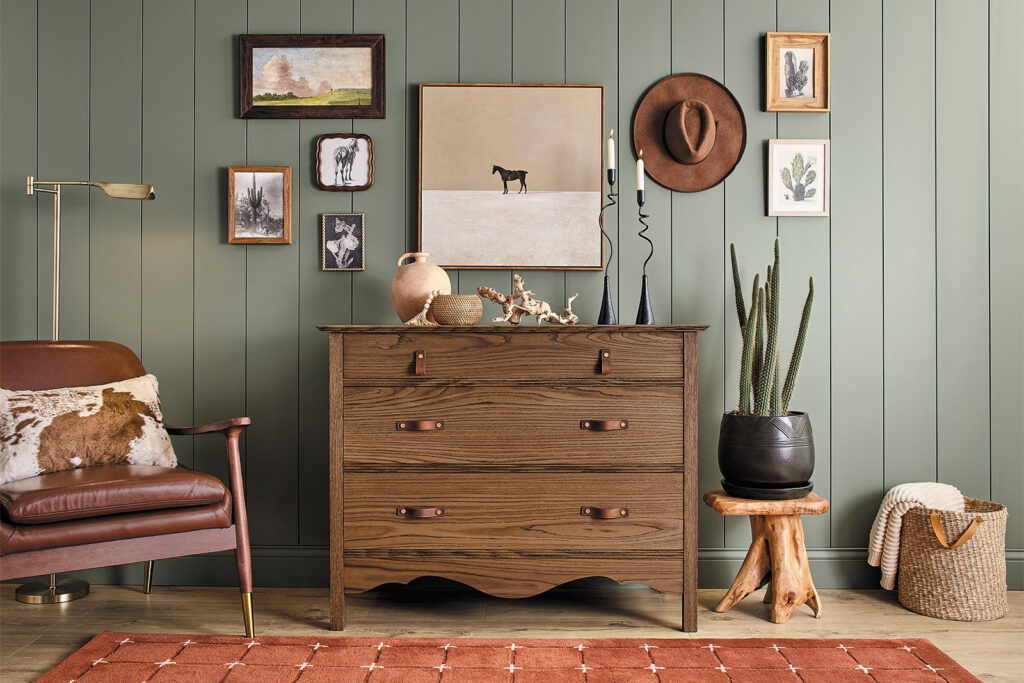
Warm Mahogany by Glidden
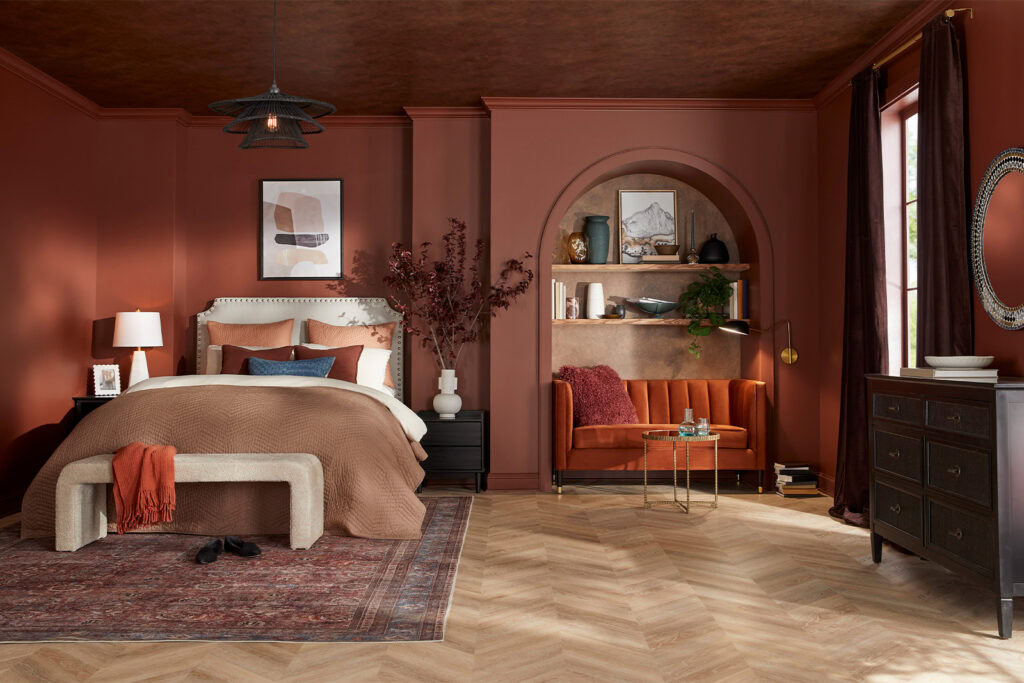
Glidden calls Warm Mahogany “a rich, grounded red that has a classic vibe, but feels brand new when used in big doses or sleek designs.” This shade would be perfect for color drenching, as we can see here in the photo above. It’s striking, yet organic, so it’ll never feel too harsh. “DIYers are faced with selecting a color that fits within the larger lifestyle of a space, not just one prescribed function or moment in time,” says Ashley McCollum, Glidden Paint Color Expert. “We’re torn between colors that feel authentic, personal, and safe, and those that give a rush of newness, risk, and excitement. Converging style and history, Warm Mahogany is a perfect match with the Glidden brand’s 150-year heritage—bold enough to draw immediate attention and reserved enough to make a timeless statement. This color truly outlasts the moment and owns the mood!” McCollum adds.
How to Achieve the Chic Western Decor Style at Home
An expert shares her tips for how to get started.
Read More

Bree Pulver O'Hagan
Bree is the Senior Digital Editor at DrewandJonathan.com. In the past, she’s worked for publications focused on home improvement and sustainable living. Bree’s Pinterest board is filled with cozy textures; vintage patterns; sculptural furniture; and moody, warm-toned colors. She has a degree concentrated in the intersection of writing and architecture, which influences her passion for exploring creative solutions to unusual home layouts and stylish renter-friendly decor. She’s a self-proclaimed pro at finding the best antique furniture in the most unlikely of places (but her cat Blue can certainly back these claims).
⚖️ How We Choose What to Recommend